DiscoverDYCD
How I made NYC's youth programs mobile-accessible, for 100,000+ kids a year
Context
DiscoverDYCD is New York City's public front door to its youth programs. Parents use it to find free after-school and summer programs across the city, which together serve 100,000-plus young people a year.

The redesigned home screen in mobile and desktop screen sizes
Problem
The site hadn't been touched in eight years and was built for desktop. For families reaching it by phone, it didn't work. Search and filtering broke on a small screen.

The original home page on mobile before the redesign
What I did
I audited the site, confirmed the problems with a user survey, and rebuilt the homepage, search, and results mobile-first. A focus group of city staff validated the direction.

The redesigned mobile home and menu screens
Impact
Delivered to DYCD and in development now: a mobile-first rebuild of the city's youth-program front door serving 100,000+ families.

The redesigned mobile screens
My role
Senior UX Designer
Year
September - December 2025
Duration
3 months
A peek at the final prototype
Check out this recording of the prototype I presented to an internal focus group of city employees.

The families most in need had the worst experience
DiscoverDYCD is the front door to New York City’s youth programs, including after-school care, summer camps, and youth employment. These programs often get 100,000+ young people to apply each year.
The site hadn’t been meaningfully updated in eight years, and was only recently being adjusted to meet new accessibility laws. But worst of all, it had never been built to work on mobile.
DYCD is an anti-poverty agency, and the families who rely on DiscoverDYCD to find free care skew lower-income. This matters because nationally, among households earning under $30,000 a year, roughly 1 in 3 people rely on a smartphone as their own way online.
What was at stake?
The families who most need free after-school care or a summer program to cover a workday are reaching the site on a device it was never designed for.
Because seats are limited and fill up by neighborhood, findability is what stands between a family and care they can actually reach.

The original site's program details
Meet Helen, a working mother
Helen is a working mother in the Bronx, and her shift at her job doesn’t end until 6 PM. Her 3rd-grader gets out of school at 3. She can't afford daycare, and a free after-school program would close that three-hour gap if she can find one before the seats run out.
She hears about DiscoverDYCD from a colleague and checks it on her phone during her lunch break. The page doesn't fit on the screen.
The site serves all of NYC, so she needs to find free programs near her, not in the middle of Manhattan. But the finding a program is harder than it seems. To search, she needs the program's exact name, which she doesn't have. The filters are stacked in an order built for city administrators, not for her.
Worst of all, she has to click into each card to figure out if this program is even near her.
One user even said she went to a library to get through the site, because she couldn't use it on her phone.
Helen doesn't have time for that. And figuring out this page on her lunch break, before seats fill up, is the difference between having her 3rd grader taken care of or not.
How I designed a mobile-accessible site
The engagement had a three-month scope. The application flow was the deepest problem, but its questions were locked by legal requirements, so the chief IT architect and I focused on findability and mobile.
I prioritized the phone over desktop experience
Most families reach DiscoverDYCD by phone, so I rebuilt the site mobile-first rather than adapting the desktop layout down.

The redesigned mobile home screen
I designed filters for parents, not administrators
The old filters led with administrative categories like police precincts. I demoted those and brought forward the filters a parent actually uses.

The filters redesigned for mobile
I built search around how people look, not how the database is organized
The old search needed a program's exact name. I made it tolerant of neighborhood and need.

One phone with a search screen and a second with filters
I led the card with information parents recognize
I put the provider families know first, the Boys & Girls Club, over the school, with a "0.5 miles away" tag.
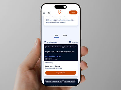
The program card redesigned for mobile
I flagged what design couldn’t fix
Parents apply and hear nothing for months. That gap sits between the site and the programs, not in the design, so I named it to the team to own internally.
"I didn't know whether or not the application was accepted and what was the status."
-Survey participant
Result: a better experience for 100,000+ families
The redesign was delivered to DYCD's development team and is in development now. It isn't live yet, so there are no enrollment numbers to point to. The direction was validated by the user survey and the focus group, and the chief IT architect wrote a letter of recommendation on the strength of the work.
What I'd do differently...
I brought development in too late, at the very end, and it cost time. The fonts in the client's brand guidelines weren't open-source, so the team couldn't use them, and we had to swap them at the last minute. Next time I'd pull developers in from the first week, so constraints like that surface before they turn into rework.

Typography guidelines from the city
"Sarah’s ability to translate research into actionable design was one of her greatest strengths. She created and prioritized user flows, developed low- and medium-fidelity wireframes, and built a functional prototype for usability testing.
Her review sessions with DYCD were thoughtful and well‑structured, and she iterated on the design, often in real-time, based on user feedback.
By the end of the engagement, she delivered a complete suite of high‑fidelity wireframes and transferred all design artifacts to support developer implementation."
-Michael Bacarella, Chief IT Architect DiscoverDYCD
